Rippling
Prospect gifting solutions for Rippling’s evergreen outreach campaign.
-
Project Manager: Zachary Fickenworth
Marketing Manager: Rachel Cantor
Copy: Bao Phan
Designer: Logan FloridaI was brought in to design the packaging and supporting visuals for Rippling’s evergreen prospect gifting campaign. Working closely with the Rippling team, I translated campaign messaging into a cohesive physical experience that was interactive, impactful and consistent with brand guidelines.
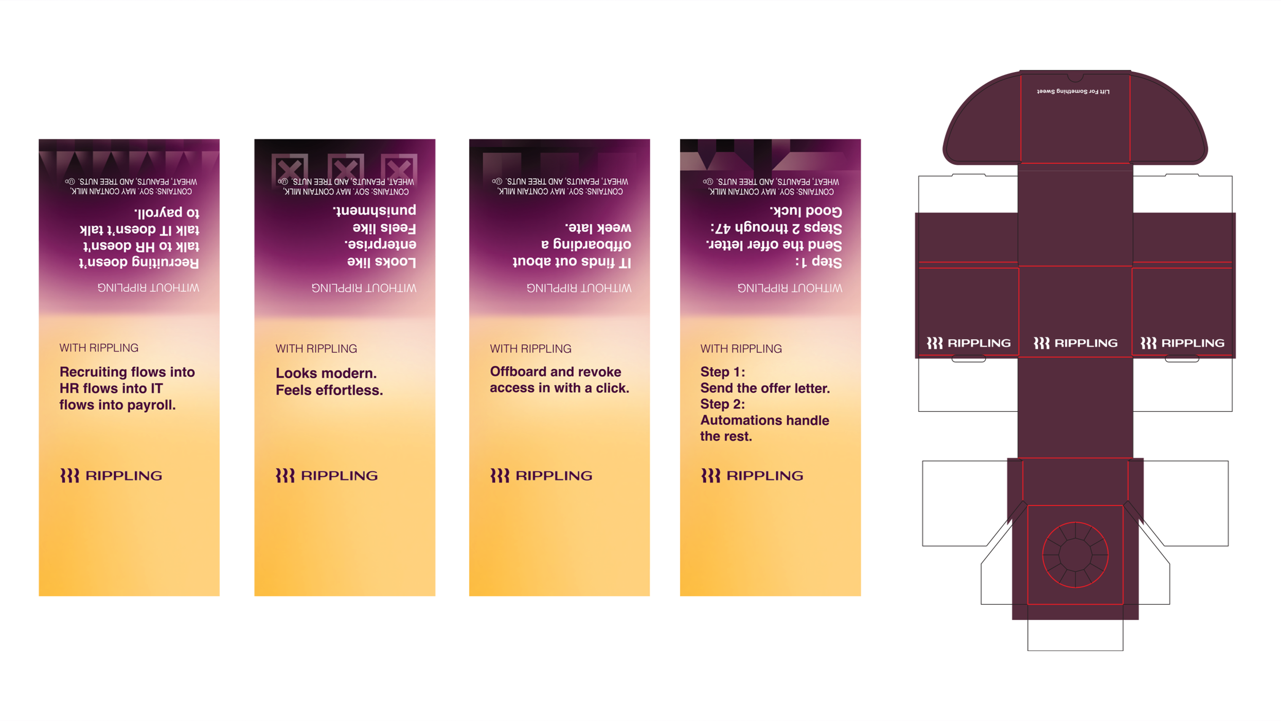
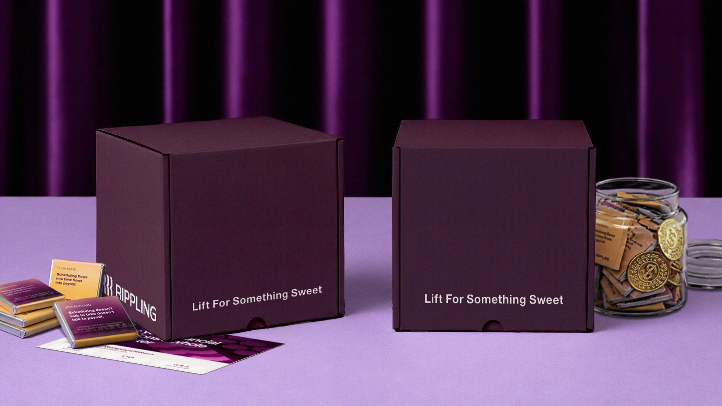
The project included developing and refining custom chocolate wrappers, shipper packaging, and a flexible system of visual motifs designed to work in tandem with the campaign copy. From early design exploration through final production files, I considered how each element would function individually and as part of the larger unboxing experience. The final system balanced strong brand recognition with enough variation to support multiple value props, allowing the campaign to remain visually engaging, scalable and adaptable across ongoing prospect outreach.
Together with Rippling Spend’s copywriters, I worked on an interactive, visual representations of the pitfalls of old and outdated HR systems through the front and backs of chocolate pieces.
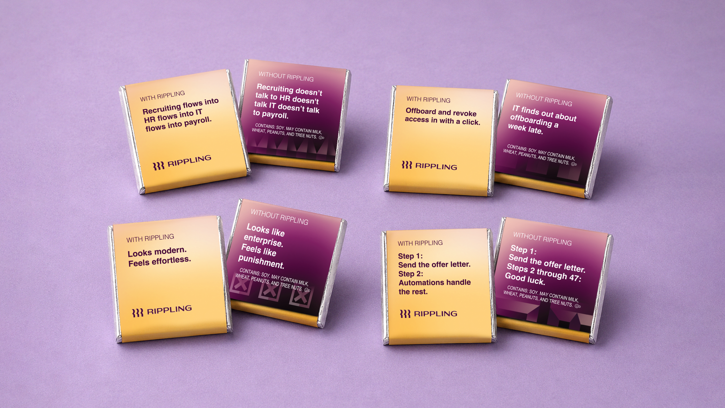
Final deliverables included four visual motifs, chocolate wrapper designs ready to print and cardboard shipper design for chocolate jars.