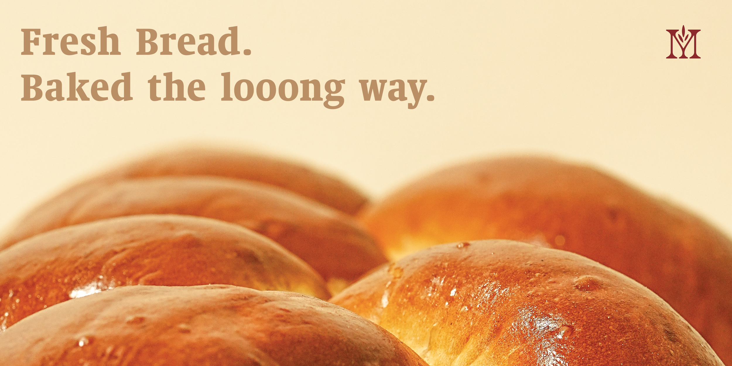
Manna Bake House
Manna Bake House is a modern bakery rooted in comfort, craft, and everyday ritual. Born from a bakery merger, built around thoughtfully made breads, pastries, and seasonal offerings.
-
Role: Brand Designer
Since 1985 Tel Aviv Bakery had been a leading kosher bakery serving the Chicago area before acquiring and merging with Challah house, a small at-home bakery lead by a husband and wife duo. The merger brought new recipes and energy into the bakery’s offerings and baking style, as well as brand confusion and frustration at what their clientele bases saw as two different companies.For this project I was approached by the owner to rebrand the company for the new merger. I was tasked with creating the brand identity and an implementation plan that would ensure brand clarity and inform both customer bases of the merger and new product offerings.
During the discovery phase, I explored several directions that would support the new business: modern appeal, historical story, modern luxury, chicago local. Initial identities were developed for each of these directions, and through community outreach, I found that modern appeal with daily bread messaging resonated most effectively within the local demographic.
The serif mark was inspired by the geometry of bread crumb, remaining radically soft, yet structured. The final direction brought in a neutral, warm palette to support the new found hominess for the bakery’s menu, and paired it with modern graphic motifs that would position the bakery for growth across ecommerce channels and multiple physical store locations.
This direction and brand voice was stress tested in initial merger announcements, which emphasized a single bakery “baked into one”. The implementation plan and brand guide was developed along with the website and given to management to follow along with deliverables. For the first time in Chicago, kosher baked goods were available to order for direct home delivery fresh from the neighborhood bakery.
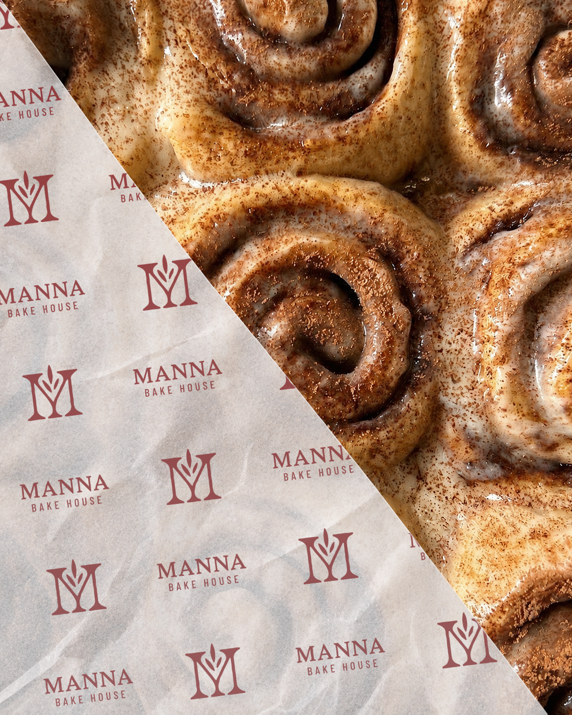
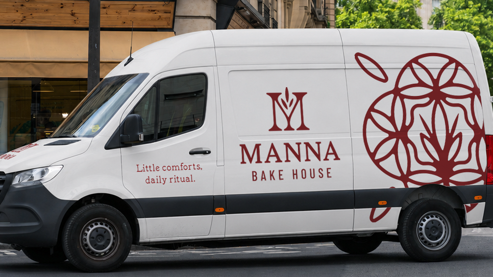
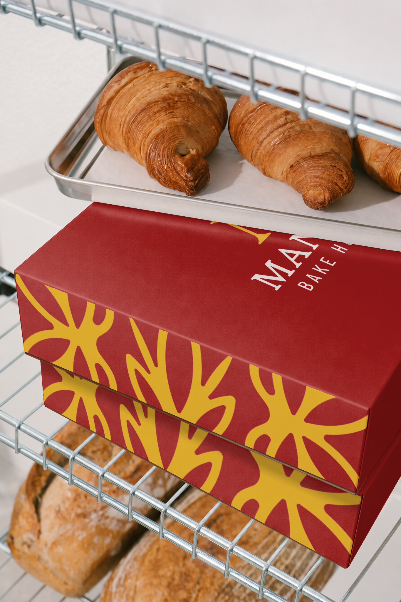
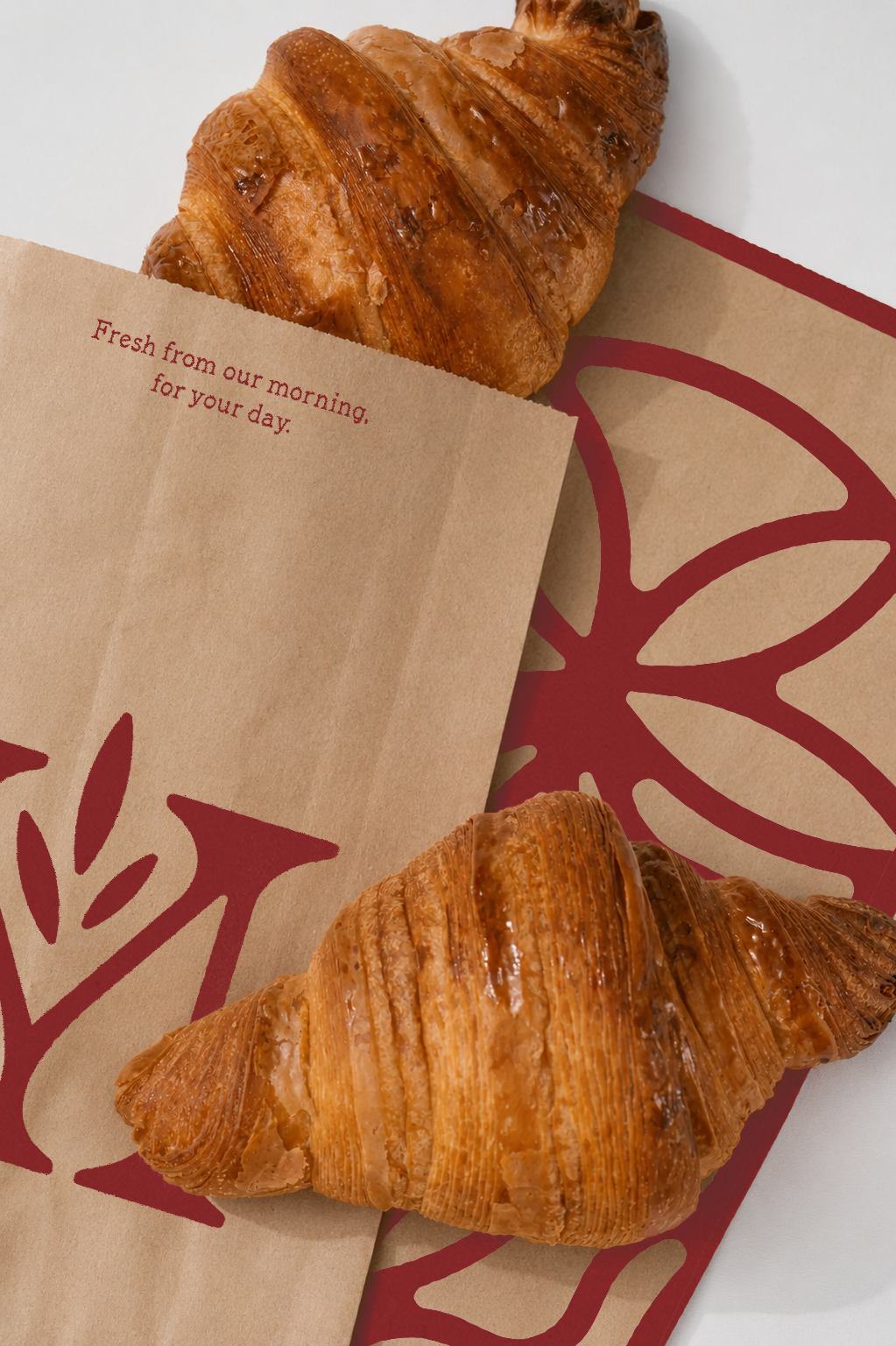
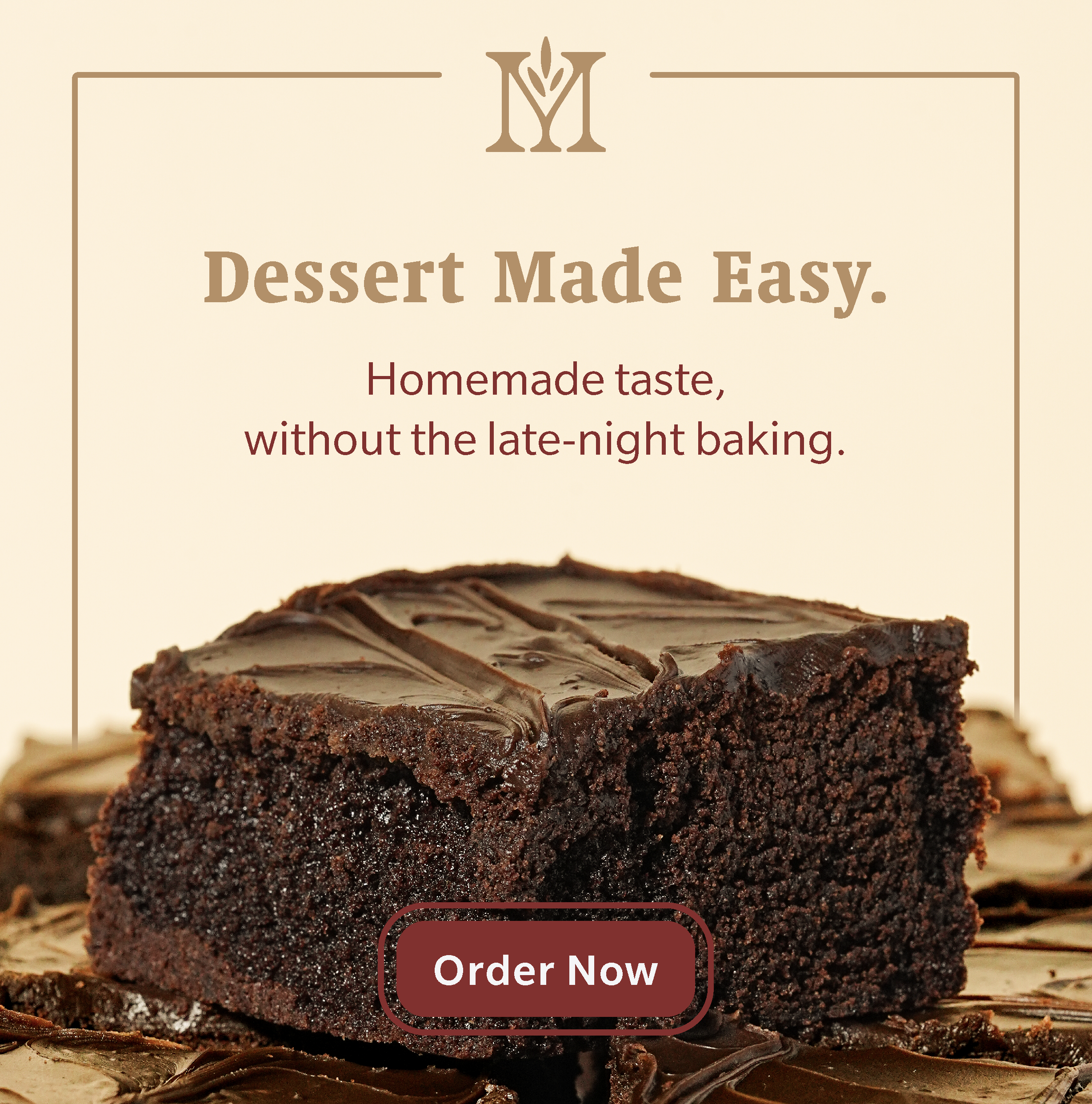
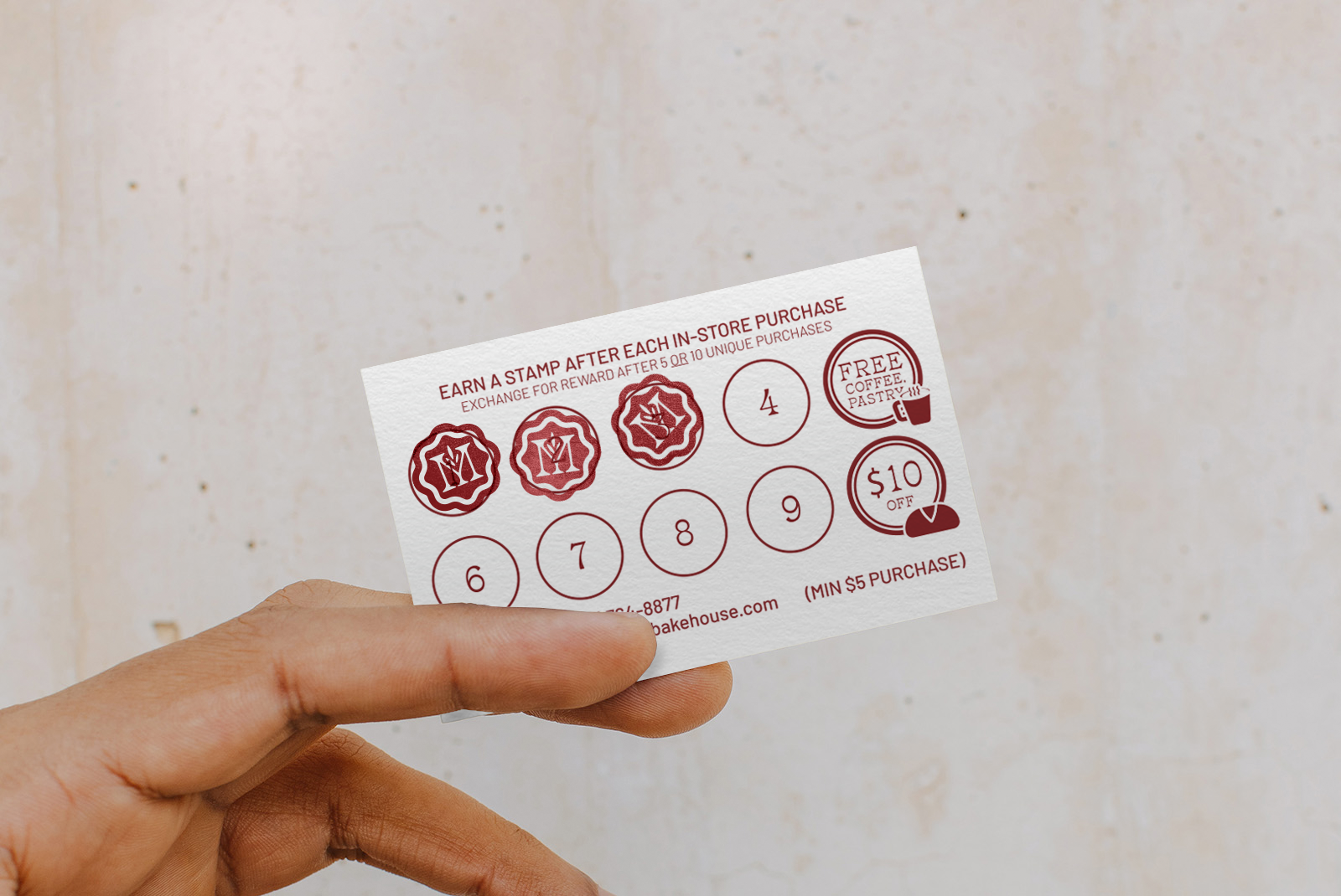
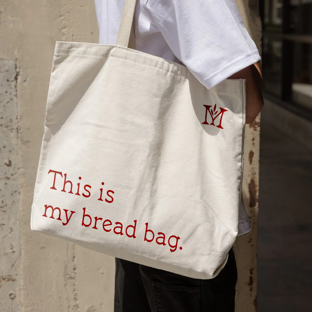
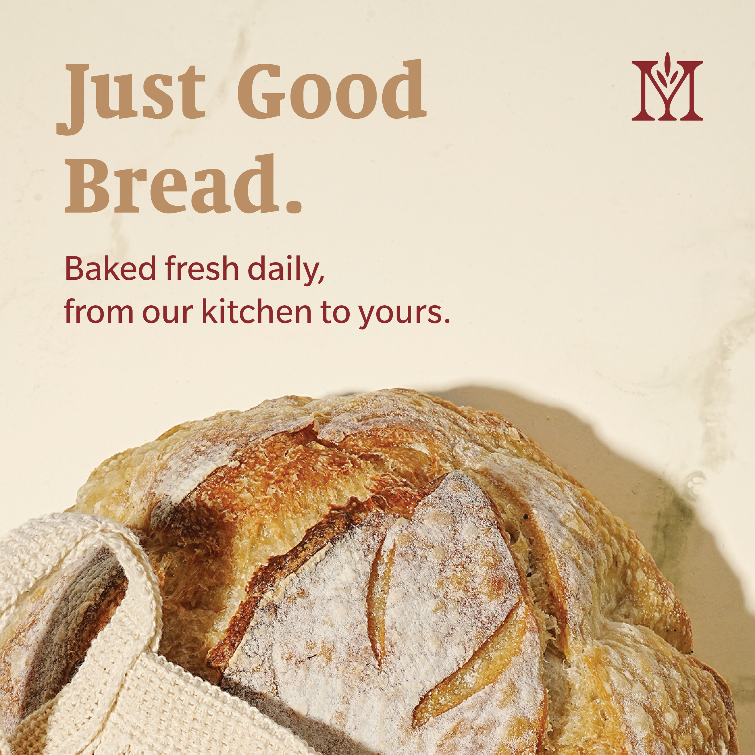
For this branding project I proposed a focused, compact system of marks, palette, packaging, and copy to position Manna Bake House as ‘your local bakery’. I defined the visual system around a warm, brick oven red, supported by eco-friendly kraft paper packaging system, and daily bread messaging.
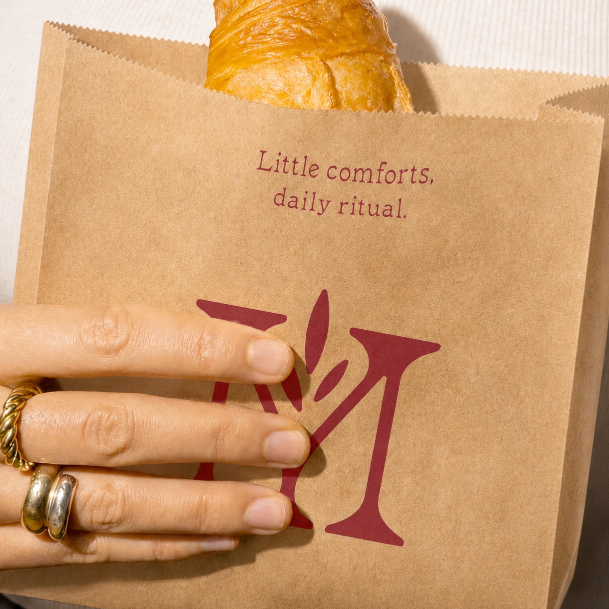
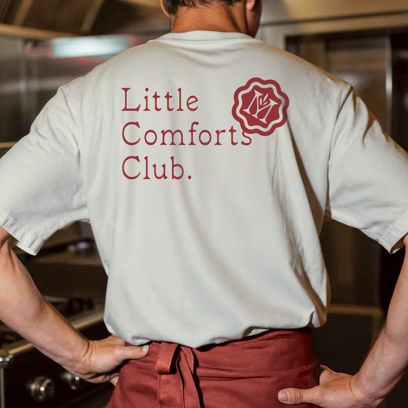
The brand needed to be equally at home at their retail location; online; at a farmers market; or on a customers kitchen table.